Case Study 1
This landing page design is from Dribbble.
I like this landing page for how beautiful it looks using just simple shapes.
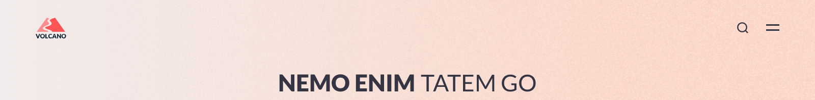
The use of gradients in the background, the high contrast element (the supposed lava on the ground) and the non-linear border elements are what I believe make this design stand out.
Albeit being a great design, I have my doubts about how feasible it is to translate this design into a mobile-responsive webpage. Regardless, there are elements in this design that I think are worthy take-aways.
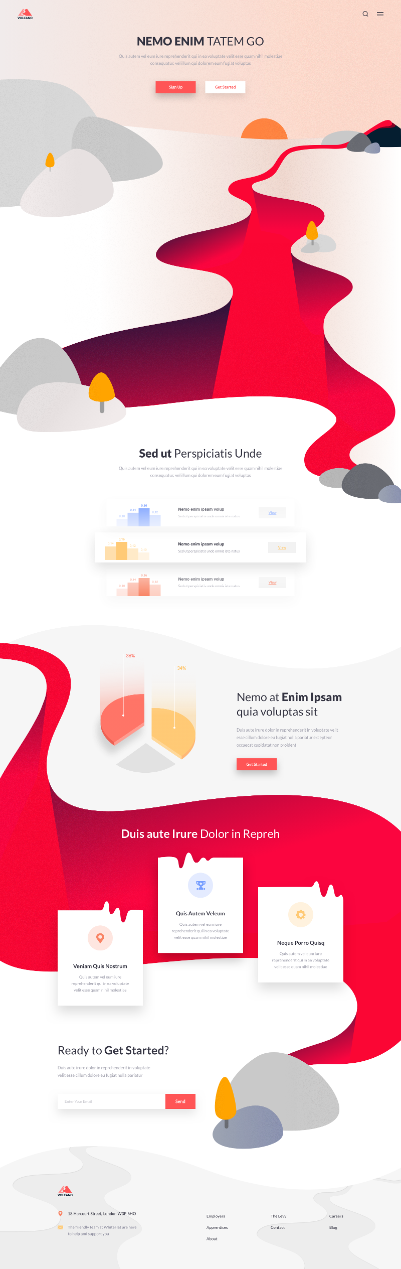
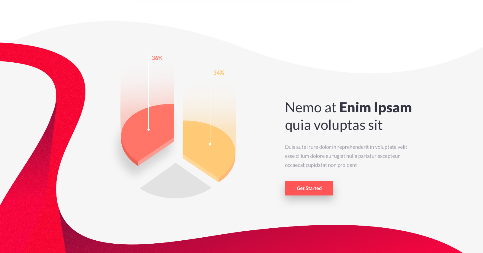
Logo
The generous amount of space from the logo to the next closest element (the hero header) emphasizes the logo of the site despite its small size.
The same applies to the action icons at the top-right corner.
Call-to-action Buttons
These two buttons are the only things that the user can see (other than the hero header and subheader) and interact with for a long while before they scroll to the next "front" element.
I have my doubt as to how useful this will be on an actual webpage because that is a lot of space that does not convey any information except to showcase the gorgeous background illustration.
Having said that, I think this technique will be useful for a product/image showcase where the product/image is the main focus of the page.
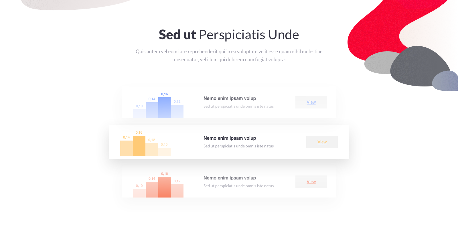
Content Section
The bleeding over of the "lava" from the hero section to this content section is a nice touch. But it may prove difficult to replicate perfectly for mobile screens.
The use of the pastel colours help draw the readers attention to these three blocks amidst the whitespace. Although the "View" button labels could do better with higher contrast.
Irregular Borders
The separation of this section with irregular borders add variety to the overall design of the site.
Irregularly-shaped Elements
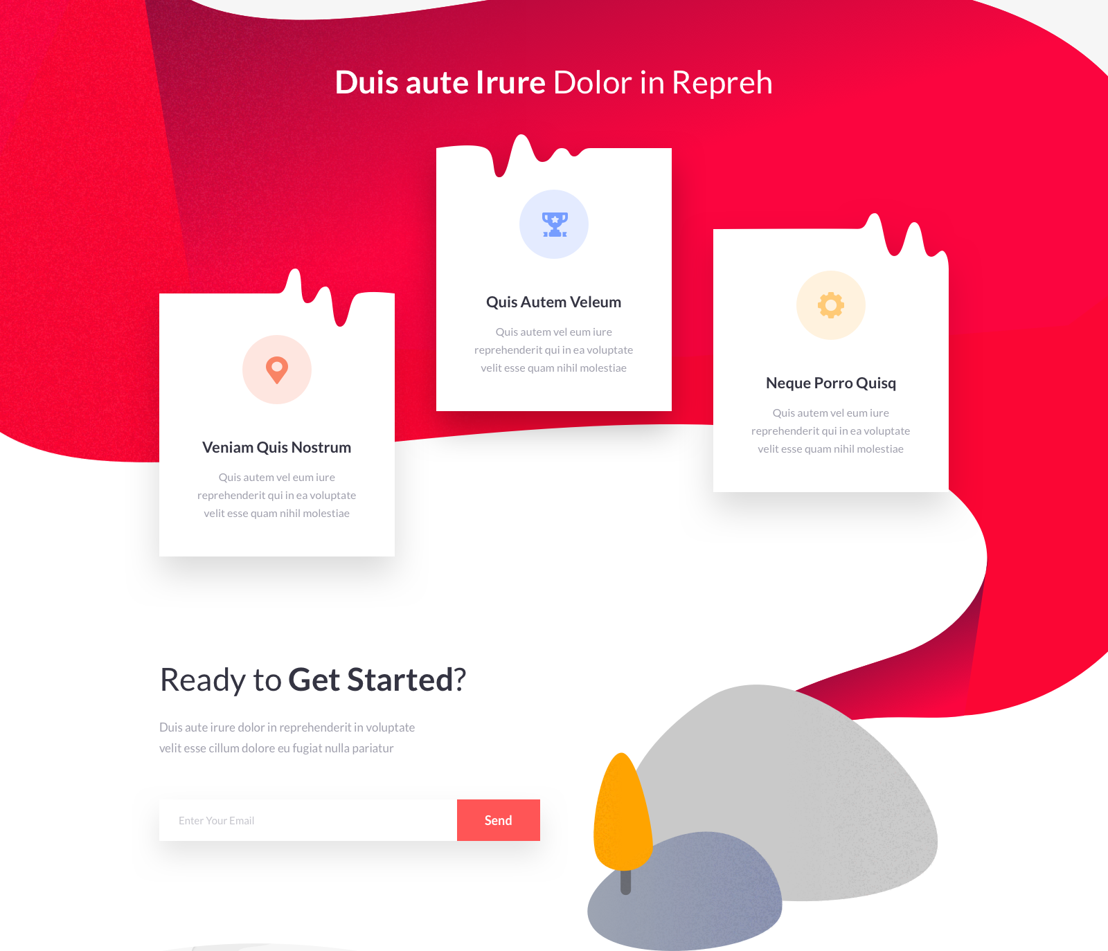
More examples of irregularly-shaped elements which, again, add more variation to the design.
My concern with irregularly-shaped elements is its practicality - whether they can be implemented for a mobile-responsive use.
The placement of the call-to-action element is highly obvious - being right at the end and floating above the copy that is above it.
Footer Variation
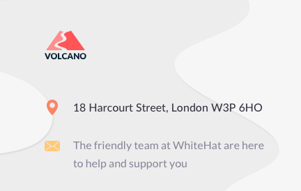
The use of coloured icons in the footer add a level of richness that you do not expect from the footer of the page.
The choice of colours is well-chosen such that they do not stand out too much.