Case Study 10
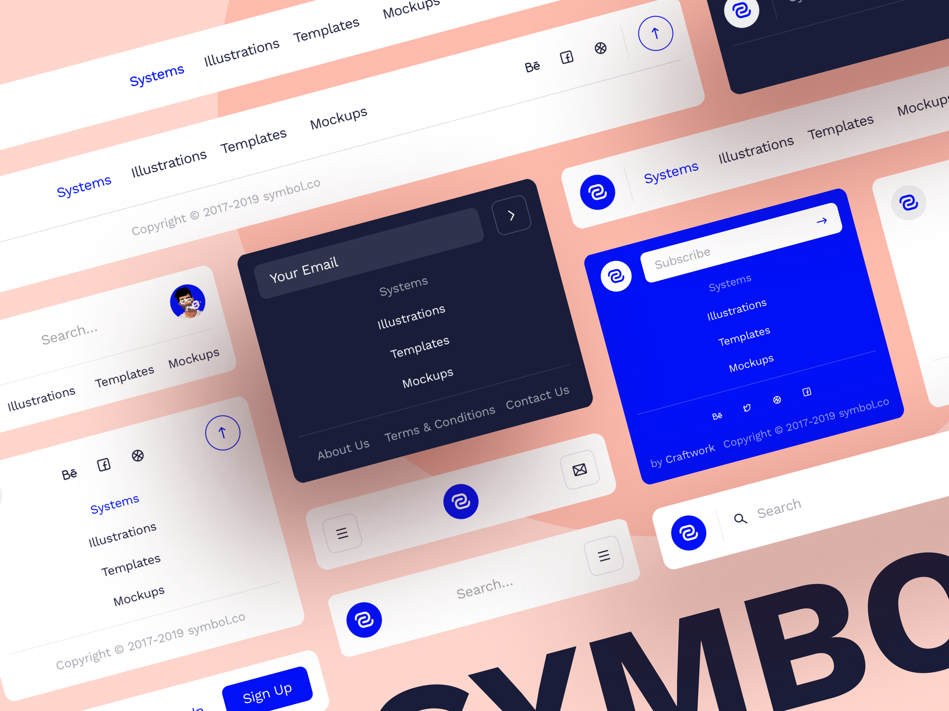
This one is straightforward. By itself, it is already a collection of design snippets.
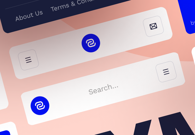

What I like about the designs are that the buttons have a soft round rectangle around the icons to emphasize the standalone icons. By themselves, the icons would be barely noticeable, and hard to tap/click.
For the icons that are close together, there are no such enclosing rectangles. And for that one really important button, a different enclosure (coloured circle) is used to emphasize it.