Case Study 12
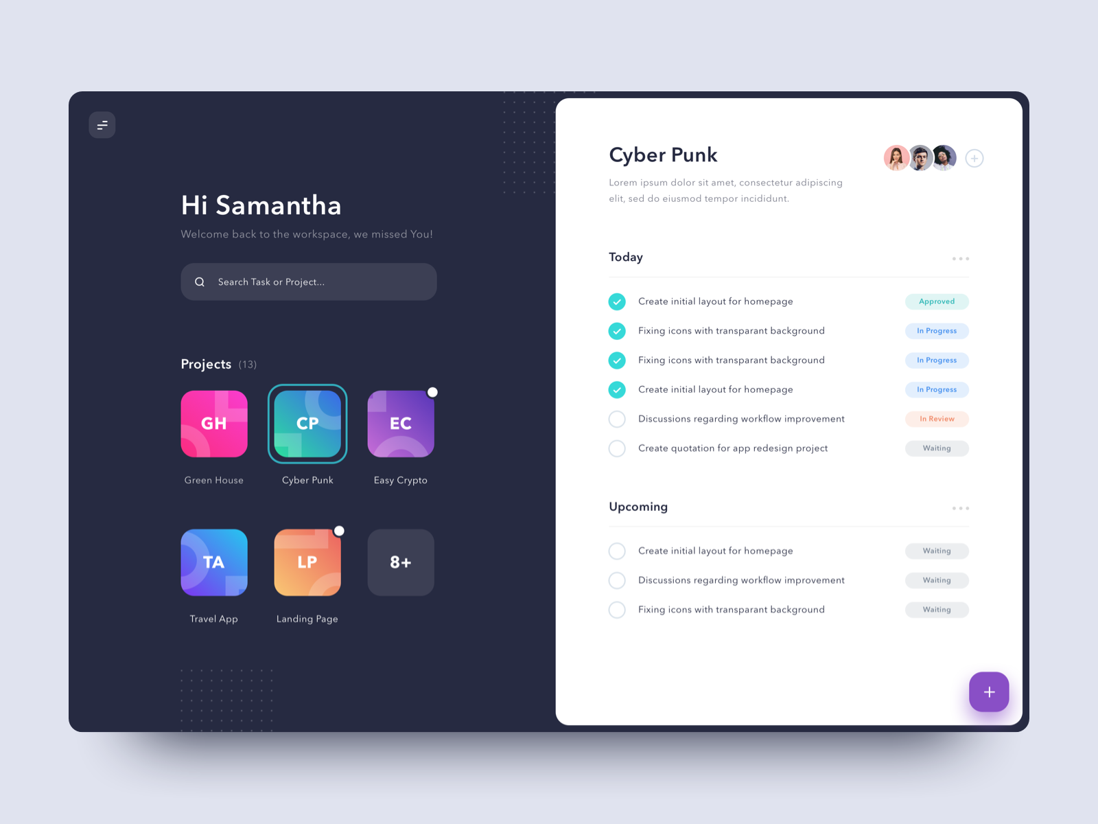
I chose this design also because of the way the simplistic illustrations look more interesting with some accents in the background.
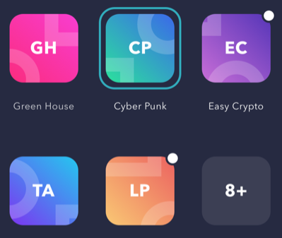
Then I saw the coloured shadow...
... and the dots.

It was then I realised this is made by the same author.
This time round, I don't like the coloured shadow as much. In fact I think there are too many colours in this design shouting for attention.

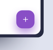
There was one thing I liked in this design, and that is the menu icon in the top-left corner. The diagonally-aligned spaces in the top and bottom line in that icon helps to indicate that it is a sliding menu. How come no one thought about this before?