Case Study 13
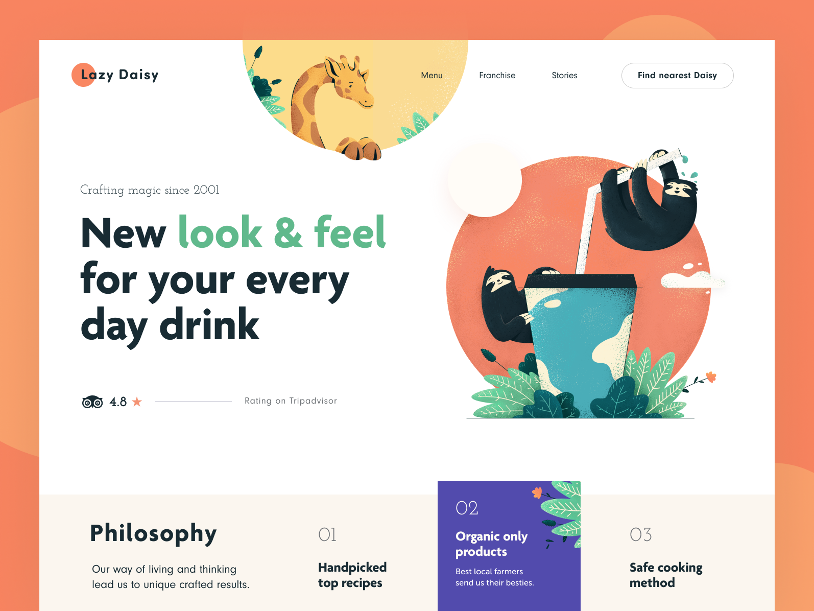
The snippet that I want to extract from this design is the row of navigation buttons at the bottom.
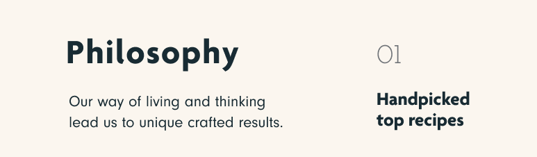
I like the way the navigation buttons blend in with the design by having some other copy ("Philosophy") in the same row, and make it look and feel seamless.
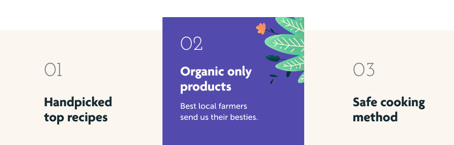
The active item in this navigation is also very well done in my opinion. It is highlighted by making it taller and a different colour from the rest of the menu.
Not only that, the active item is adorned by an illustration of leaves, occupying that empty space in the top-right corner of the menu item.
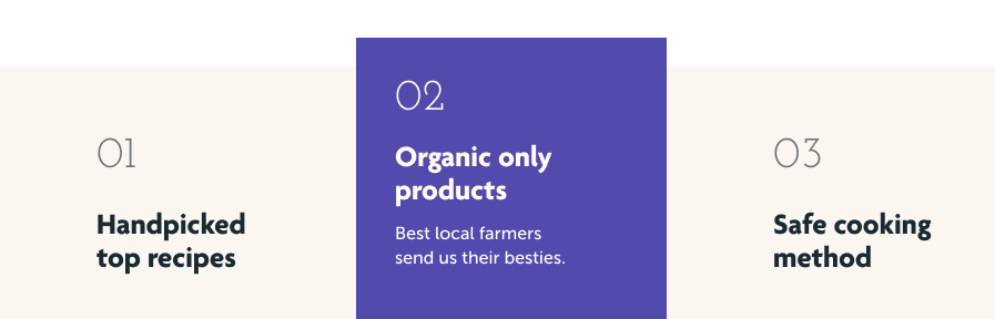
Compare this same image without the leaves — it does look a lot less interesting.
It still works, but looks a lot less refined.