Case Study 14

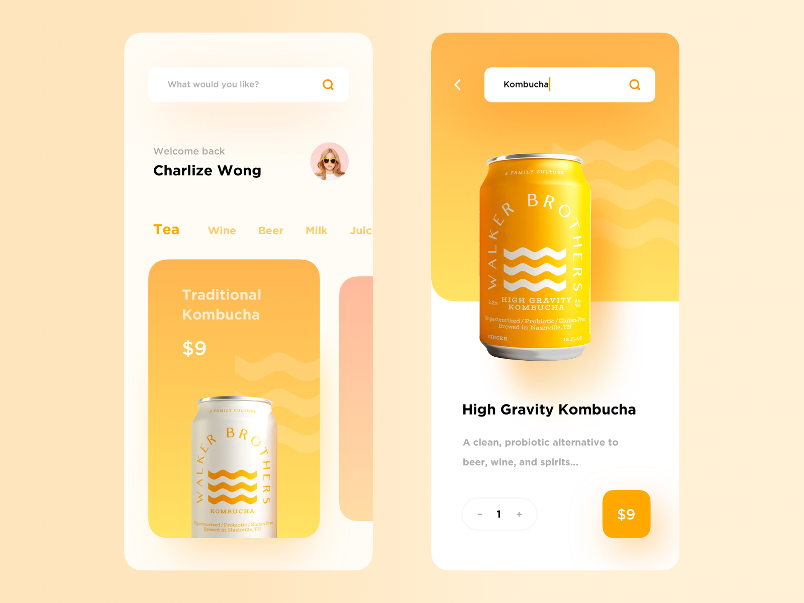
The takeaway from this design is the use of large, exaggerated coloured shadows in the design.
It is used so much that one can be mistaken for thinking that the background colour isn't white.

The first use of the coloured shadow that you can see is the search bar.
The heavy, coloured shadow encompasses the whole field such that there is no need for borders around that field.
The only issue here is replicating the same effect in CSS. I suspect you need more than one shadow definition to achieve a similar effect.

The designer isn't afraid of using the coloured shadow effect - you can see it every in the design.

Even the button too. As I've mentioned in previous snippets, having one coloured shadow may look off, but if the whole design is made up of it, it's just "normal".
If there's one gripe with the design, it is with the shadow of the orange can crossing over into the title.

To achieve this effect in production (i.e. with actual CSS), some experimentation is needed. Probably a negative top margin offset on the following title.