Case Study 15
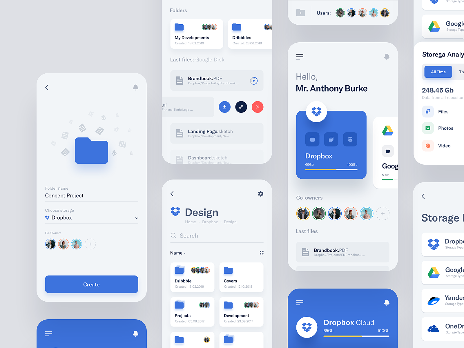
There are two things I like about this design.
They are found on the first "page".
I like that the designer used the same icon multiple times for the main image in this page, and still have it look nice without being repetitive.
Immediately you can notice that the icons are of differing sizes, orientation and shades to make the icons look different although they are all the same.
Additionally, it seems that the background has a slight radial gradient to have a kind of fading into the distance sort of feel.
The use of the Dropbox icon in the dropdown menu (below the hero image) makes the dropdown look much more appealing. Alas, this is not a native component (on the Web at least), so a custom element needs to be created in order to have a dropdown menu with an image like that.