Case Study 17
This is a collection of a few designs (by the same person/team) for a fictional service.
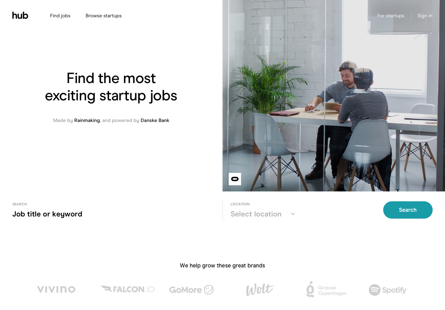
The most interesting aspect of these designs is the unconventional treatment of photos on the website.
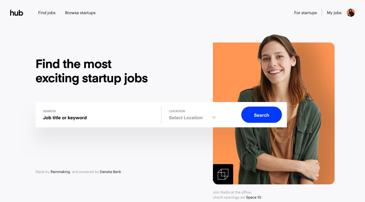
For example, this design below crops the photo such that the head is "protruding" out of the photo. An image (presumably the logo) is positioned at the bottom left of the photo. By placing the search bar partially over the photo, it helps to create depth to an otherwise plain photo.
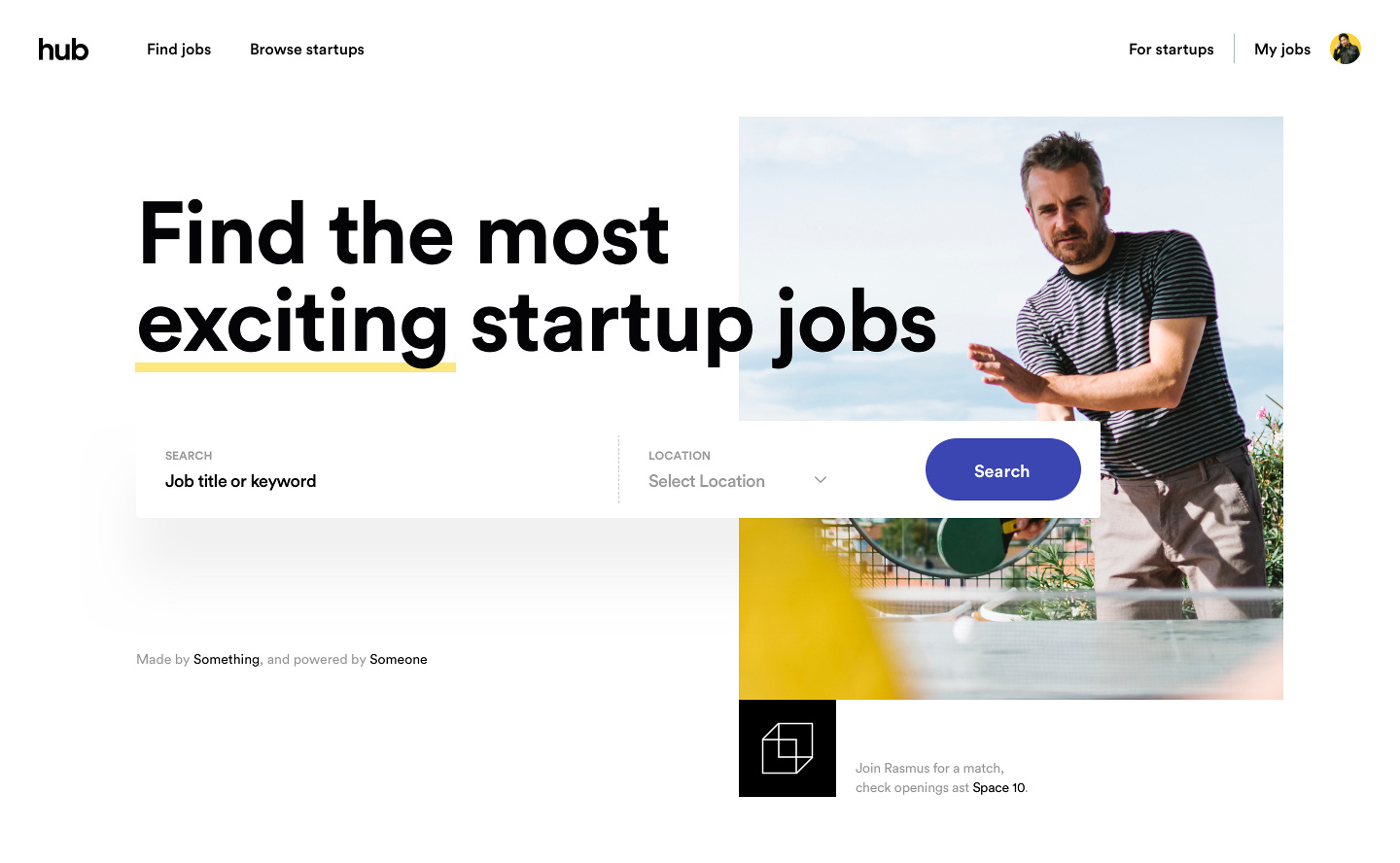
This next design has the logo placed below the photo, instead of over it like the one above. The copy next to the logo is aligned to the bottom of the image. Together, they help to create a frame for the photo without being explicit about it.
Notice how the superb amount of whitespace below the search bar is not jarring? I wonder how much of this is affected by the choice of photography though.
This next one shows an alternate placement of the search bar - expanding it to cover the entire width.
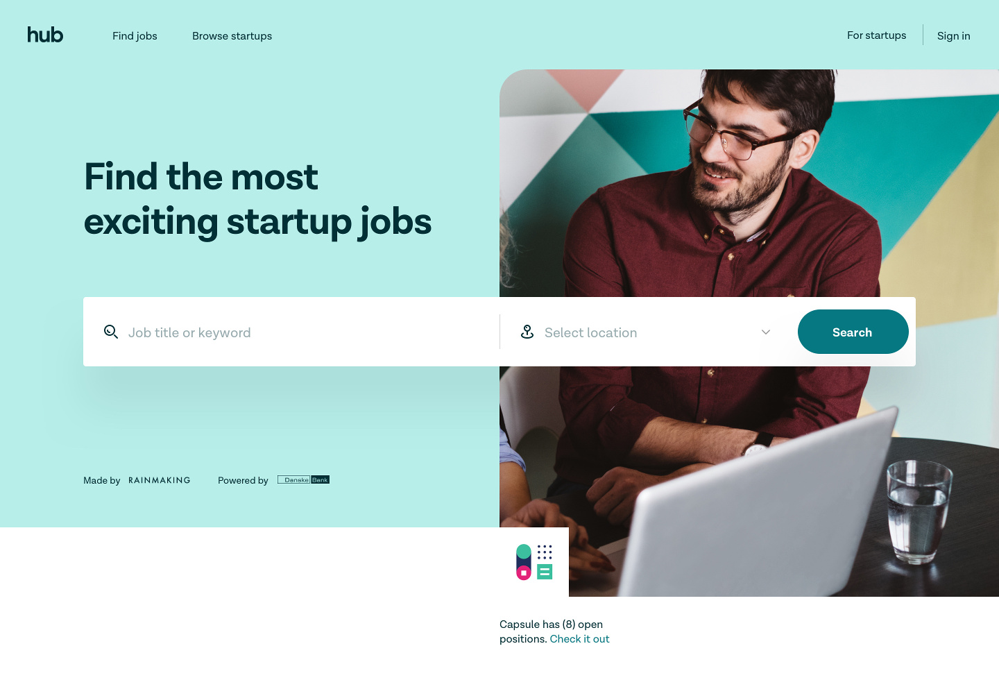
While similar, this next design has a coloured background instead of white like the others before it.
It is interesting how the white bar juts into the lower left corner of the photo. Again, this helps to add depth to the feel of the design, but I do wonder what is the meaning of the image in that little corner. Not sure how useful this technique can be used in other designs.