Case Study 19
The original source of this design is a video of the UI animations for the website.
I have never really taken conceptual designs of fanciful animations seriously because I think that some have made assumptions of native animation capabilities of the browser that are unrealistic or not useful for a website (delayed loading due to animation).
This design is live at assemblypayments.com. You can see from the final design that many of the animation elements are not present. I assume that some of the animations are just too complex (read expensive) or not doable with native browser capabilities.
Nevertheless, this particular one has some visual elements that I think are note-worthy.
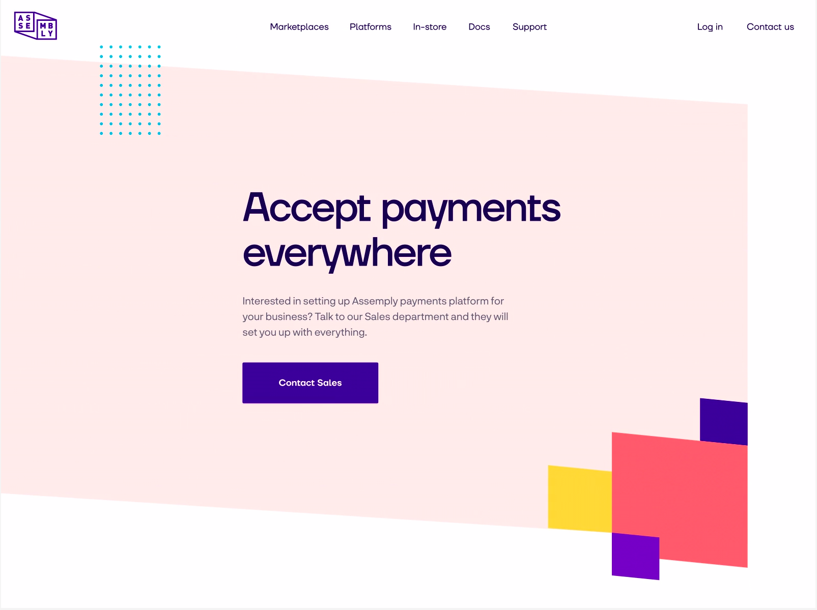
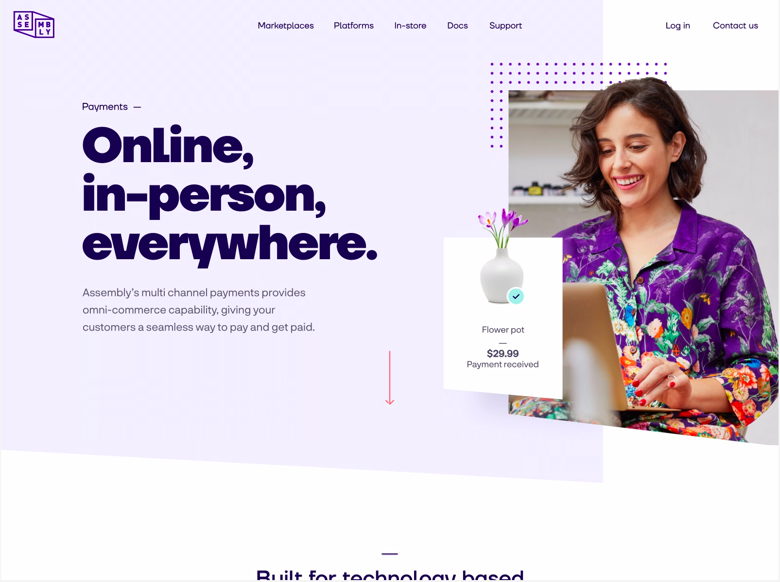
First thing that I noticed is the use of an array of dots to augment the photo. It works so well that it is used prevalently throughout the design. (Edit: I've learnt now that this is called motifs.)
I like the gradient used in this section of the page. I guess the website owner likes it too - they've used it at the top of the page as well!

This section is an example of how simple shapes can be used to make up a design.