Case Study 2
This is also another landing page design from Dribble.
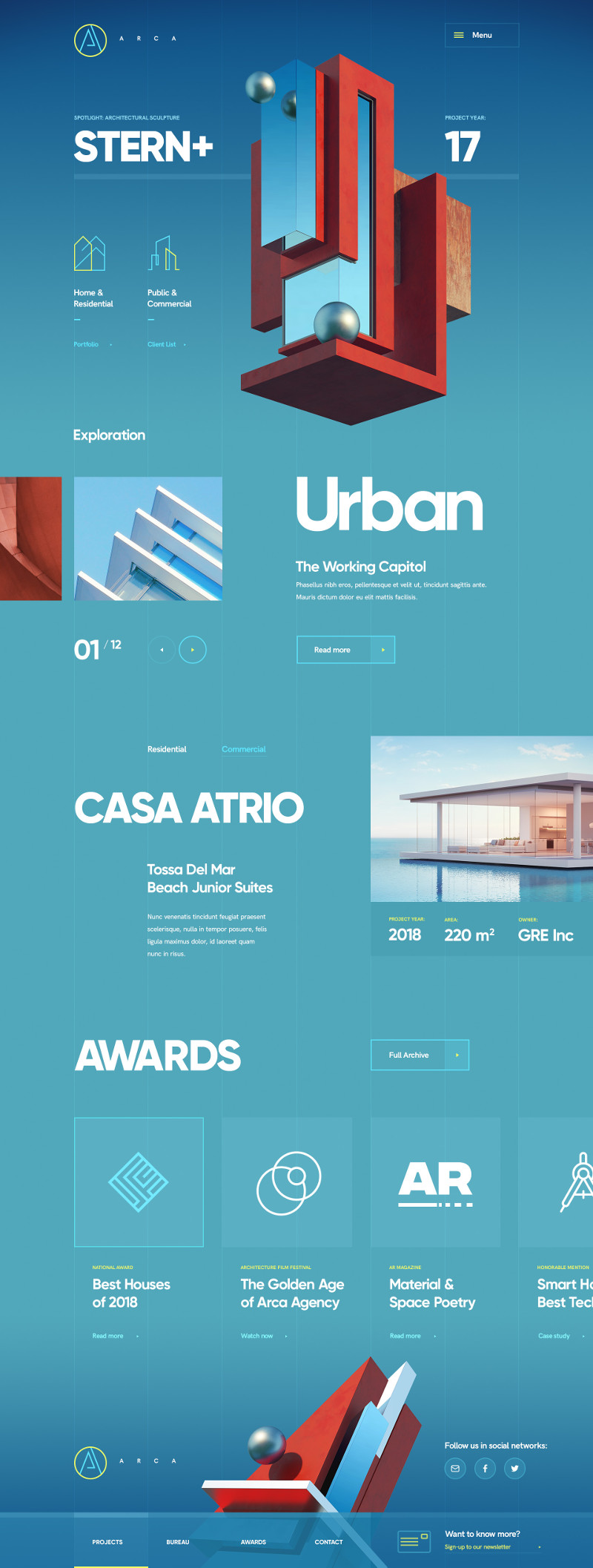
Use of Accent Colour
The use of the accent colour to complement the primary colour can be seen in many places. Here is one where the category is displayed in the accent. This goes well with the diminishing of the importance of the category by making the size much much smaller than the title.

Navigation Bar Design
The navigation bar at the footer (Extract 2) shows the use of translucent white overlay to indicate the active navigation item. The item is also further decorated with a stronger white at the top edge. The bottom edge is further decorated with a sliver of the accent colour.

Different Shades

The use of different shades of the same hue is applied here to the social media icons to add some variation to the icons which would look awkward side-by-side.