Case Study 3
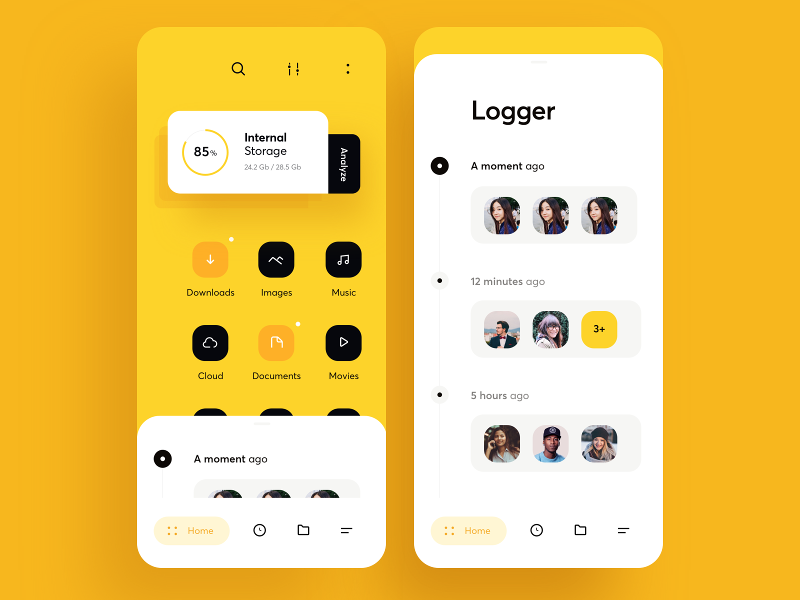
In this mobile screen mockup, there is only a primary colour and no accent colour. (Although one could argue that black is the accent.)
Narrow Navigation Bar
The generous use of whitespace means that the navigation bar at the bottom cannot accomodate the use of labels on each of the icon.
The method used here is to display the label only for the page that is showing ("Home"). This helps to solve the cases where the icon may not be common to make sense (e.g. the right-most icon).

However, the key factor for this method to work is the immediate transition from one page to another as the user clicks on each of the icons. The immediate transition is a must so that the user gets instant feedback as to whether the icon is the page that is intended.
Simple Shapes

The use of two circles, one within the other, rendered with strong contrast makes for an effectively visually-rich bullet point. (See Extract 2.)
Handling Information-sparse Pages
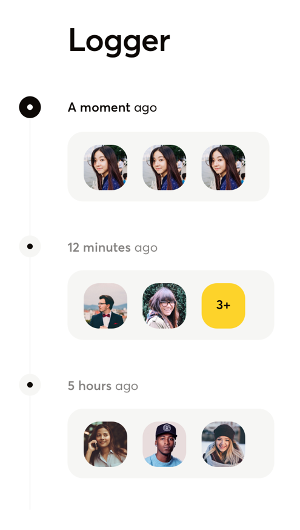
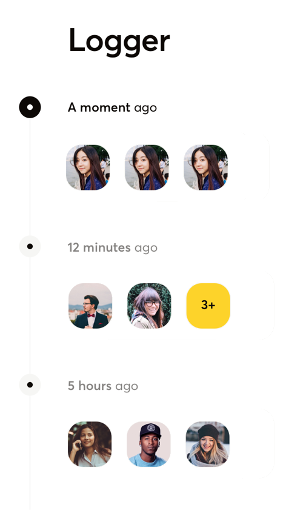
The page "Logger" shows a fairly information-sparse page. In fact, it is so void of content, I have no idea what that page is showing. And yet, the designer is able to turn a plain, boring page into one that looks appealing despite the lack of richness in the content and interactivity.
I attribute this to the use of the grey rounded rectangles to encapsulate the user avatars.

These rectangles bound the avatars together so that there is not an excessive amount of whitespace that is literally white. The grey background adds a bit a richness into an otherwise bland placement of avatars. (See comparison below.)