Case Study 4
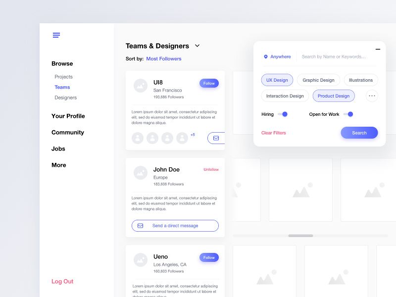
This mockup has a few aspects of the UI that can be used as inspirations in my own UI design.
Coloured Active Link
The menu in the side bar shows the link of the current page as a coloured link among the rest of the links that are grey.
The hierarchy of the links is also clearly distinguished by the size and colour of the labels.

Card Design
This card design has several aspects worth pointing out.
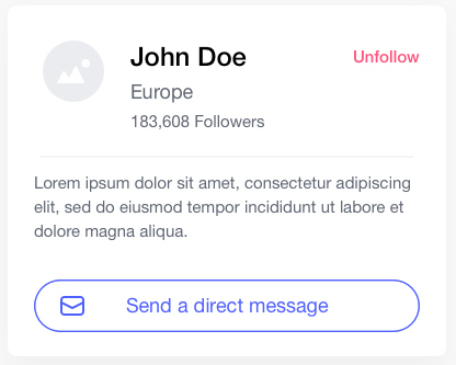
First, the use of a faint horizontal line to separate the header material from the description helps to add a little visual richness.
Second, the placement of the "Send a direct message" button at the bottom of the card uses a "ghost" button design so that it does not grab all the attention of the card.