Case Study 5
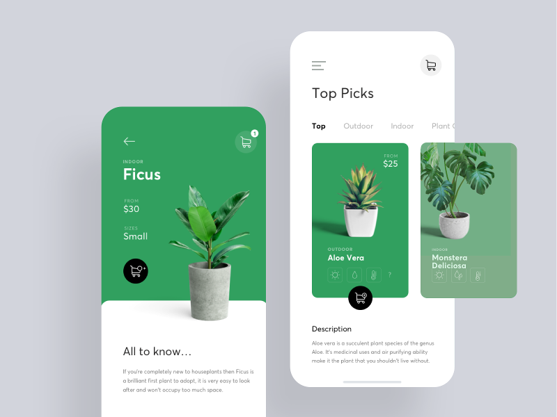
I included this design for its use of a solid, flat green as the background colour of the app.
It is not often that a solid flat colour can be pulled off in the background, especially not one with such high saturation.
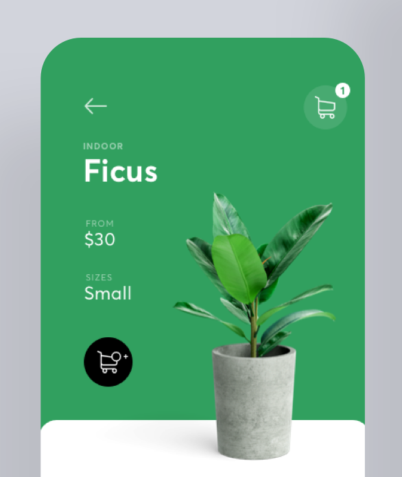
A close-up of the screen below shows the actual mockup more clearly.
It is precisely because of the high saturation of such a low luminosity hue that allows the white copy to be clearly legible.
Among the white copy and coloured background, a black circle stands out clearly as well.
This mockup begs these questions though: "Will the mockup be as pleasing if the photo of the plant is swapped with something else? Will it work with a photo of something that has no green at all?"
To find out, I have replaced the plant in the mockup with a random photo from Unsplash.
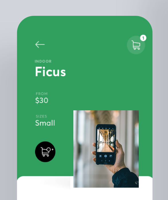
Photo credit: Sajjad Zabihi
Not nice at all. Simply slapping any random photo in place of the plant image is plain ugly.
What if we mix it up a bit by placing this photo within the photo of a tablet?
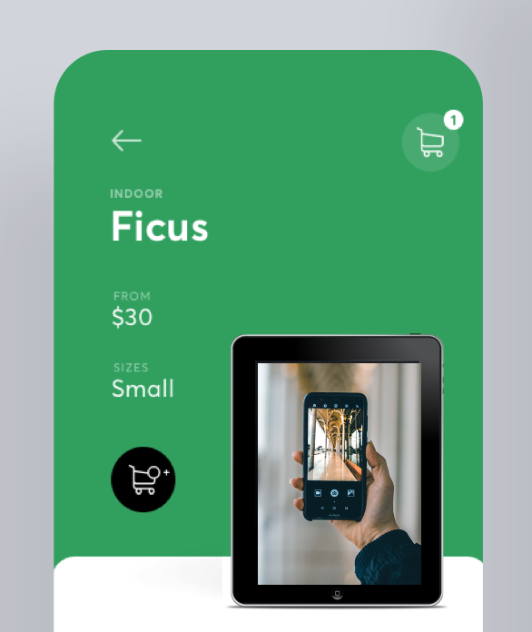
Tablet image by OpenClipart-Vectors from Pixabay
Personally I think the addition of the tablet makes the whole thing look better.
I do think that this clear segration of the background colours works well with a "physical" object that casts a shadow as though it is on a table. Furthermore, who is to say that this wouldn't look better with a gradient on the green such that the lower part is darker, giving some kind of depth perspective to the interface.