Case Study 6
This mockup has several UI components worth noting.

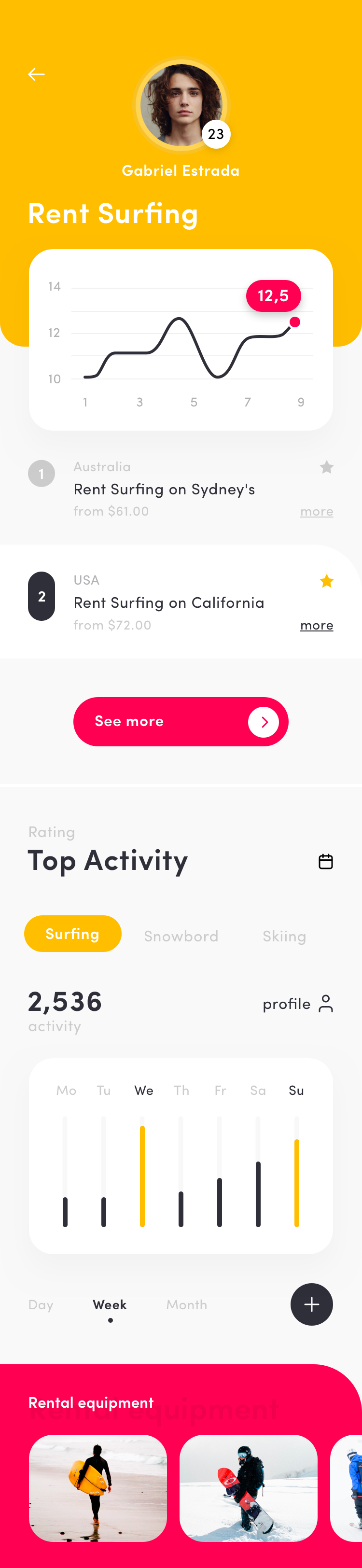
Numbers
To make numbered lists more interesting, consider wrapping the number inside a "pill".
CTA
A call-to-action (CTA) button needs to draw the user's attention so it is fine, perhaps necessary, to be more fanciful.

Navigation

This rendering of a series of links is good for use as either navigation or tabs.

Having the copy of the selected item of a stronger contrast, with the touch of a dot, is a good way of emphasizing the selection without being overly flashy.