Case Study 8
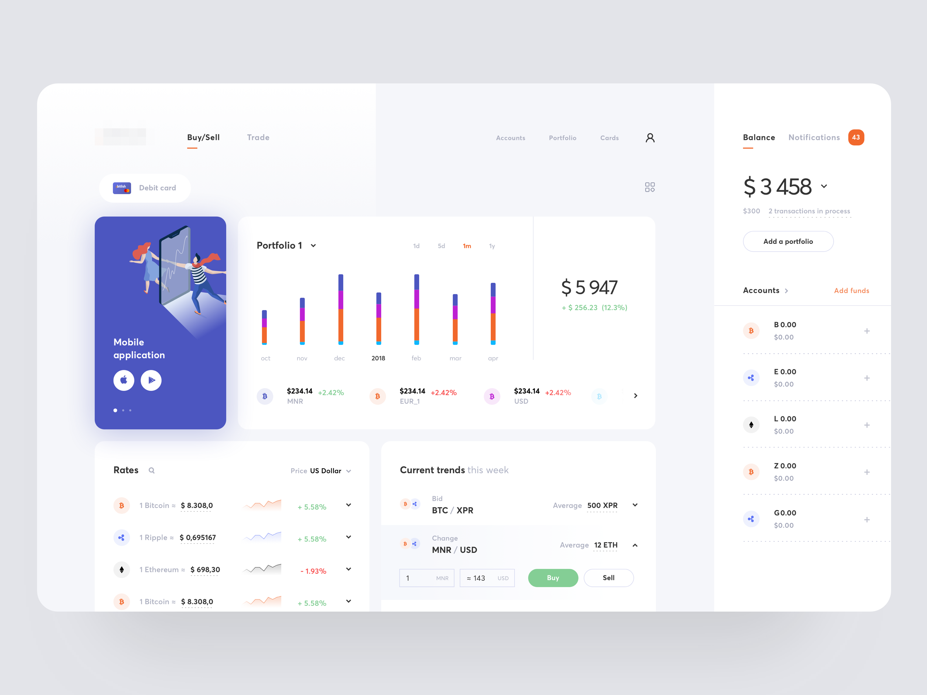
The most interesting thing about this mockup to me is the use of complementary colours for the icons.

The icons are quite small, and quite unfamiliar to most people. Enclosing each one within a circle helps to "enlarge" the icon and makes it more visually identifiable as an icon as they then have the same outline.

The choice of the colour for the circle is important. Take for example this one on the left: the blue is nearly indistinguishable from the white background. The blue for the icon can be of a darker hue so that the circle can also be more visible.


Another interesting use of such an icon is when they are placed side-by-side and have them overlap the other slightly.
This method allows the association of multiple icons for an item on screen, and still have it make sense. Without the circles, this technique can look quite bland.